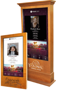
It's hard to say - I mean there is a lot to like. One feature is the ability to offer a slideshow of photos. Something the felt board can’t offer. When visitors see their loved one on the Funeral Screen, well the reaction is comforting.
In addition, if there is one thing that people ask often it is "What time and where is the mass tomorrow?," or "What church is it?" With the Sedona, they no longer have to ask us. It's right in front of them. On a felt board, you are limited on how much information to put up. The Sedona Funeral Screen is much more informative and it easier to populate with information.
I usually place the obituary on the display for people to read as they wait in line for the register book. I like the fact that the obituary is visible and I include the suggested place for donations so families have that information easily available.
I get a little fancy with my display. I have my backgrounds change. I add backgrounds that are based on the obituary of the deceased - say he was a veteran who also loved football… I would have those two backgrounds alternate. These are details that personalizes the experience for the families.
Also, having the current and the next day weather forecast displayed is also a great feature. It helps visitors plan for the service the next day, whether or not an umbrella is needed, or appropriate attire to wear. Having the time and date displayed are a nice feature to have up also.


